Wednesday 16 December 2009

Screenshots


Screenshots


This was my original front cover however, i decided to change it to make it look more realistic and to appeal to the target audience.

Tuesday 15 December 2009

Final front image

This is the first version of my main image.


This is the cut out version of the main image.


This is the edited version, as i cut out the image and put an outer glow on it to make it stand out.

I changed the image once again as it wasn't right for the audience and front cover.

Contents and Double Page Spread images

Contents images
This is an image that relates to my front cover.
This is the final image for the contents page, an article about Cheryl Cole. I edited two images and put them together using Adobe Photoshop to create this. To make it look like she is standing by her posters of Cheryl Cole to re-address the message of her being a crazed fan, I blended and blurred around her head in with the other image. I made the background image darker using Adobe Photoshop to make it look like the camera flash on her face mainly.
This is the rough and cut out version of the original image. I made her head and her hair look neater by blending and blurring it. I also edited the top of her head as in the image i had chopped it off. I done this through Adobe Photoshop by colour picking her hair colour and painting and blending it in with the rest.
This is the original image i had used on my contents page before editing.
This is a image for my contents page relating to all the letters sent in from fans.
This is another image used for the contents page to relate to the Double Page Spread.


Double Page Spread Images


Monday 14 December 2009

Saturday 12 December 2009

Rough draft of front cover and contents page


This was my first draft of my front cover, as i looked at it more i realised it didn't really fit with my target audience as it was to neat and organised to fit with a teenage image.

My front cover draft changed so many times, at first i was going to do the main story on the cover on Little Boots but as the quality of the image was not good enough i decided to change it. Finally, i decided that my main image would be someone who reflects the audience and have a simple story behind it such as "Celeb Hunt - who will we find next?"


Tuesday 8 December 2009

Double page spread article

Stamping over this nation!


Some boots are made for small steps, but hers are made for climbing high. Little Boots aka Victoria Hesketh is soaring to the top with her new album “Hands”. BOOM! sent Natasha Hurworth and two lucky girls, Becky Wade and Chelsey Taylor to her concert earlier this year to find out the real story behind this rising star.


She's already been named the future of pop and has been compared to celebs such as Kylie Minogue but is she really the one to keep your eye on? Performing in many different venues up and down the country you'd think that the Liverpool O2 Academy wouldn't bother her so much. However, the singer was shocked when so many crazed fans where cramped up just to see her, revealing that even the biggest of pop stars gets nervous and modest especially this former you tube star.


The evening started out cold, but the night soon warmed up with lots of dancing, singing and laughing as Little Boots was on centre stage.

Performing all the songs from her smash hit album “Hands” and gaining the audience's participation, you could really feel the excitement in the atmosphere which caused the energy levels to hit the roof. This was rather strange as she opened the night with the ninth track on the album “Ghost” which was written about being ignored by a loved one, as heard by the lyrics “do you even know that I'm here, I may as well be a ghost it's true you walk right through me”. However, the majority of her fans had that marked as one of their favourite songs all night but maybe that was just the magic of the first song.


Some of her happier songs throughout the concert included the hit “Remedy” which landed number six on the UK singles chart for 2 weeks and the less known but still great “Mathematics” which gives off a love vibe as it was inspired by the poem “Love Is a Parallax”.


Easy on the eyes as well as easy on the ears with thanks to the technical equipment that really made the show. With only a drummer and a guitarist to back her up, the show was in Little Boots's hands whether it was make or break. Showing her old band “Dead Disco” that she could make it on her own by taking charge of the vocals, keyboards, the synthesizer and not having any noticeable problems.


She kept the set simple with the instruments around the sides of the stage and a big black skull in the centre to create attention to herself and showing a bit of her personality through it. This shows that Little Boots is creative and inspires people such as Becky as she told us “I feel like I can start my own band because of her, she is an independent girl and that's what I'd like to be.”


Not only is Little Boots a talented singer/songwriter but she also has great fashion sense. It was the regular costume changes which would put her rivals such as Lady Gaga to shame that topped the night off, even leaving Chelsey saying “if Little Boots had a clothing line, I'd definitely buy it”.


One fan was so impressed that they threw a pair of knickers on stage, Little Boots laughed and replied “aww, that's my first pair of knickers I have had thrown at me, I feel privileged.”


And if that wasn't enough she was supported by Swedish pop prince Erik Hassle (age 20) who built the crowd up for a fun packed night singing his hits such as “Don't bring flowers after I'm dead” and “Hurtful”. “It was enjoyable, energetic and entertaining; He was a total babe” said Chelsey.


The girl's told us “If you ever get a chance to see Little Boots perform take it! She is fab on the TV and CDs but she's no different live, maybe even better.” Chelsey added on “It was so good, she jumped off stage and ran down the front row giving everyone high fives, I high fived Little Boots! That just made my night even better.”


Her album “Hands” was released in the UK on 8th June 2009, so grab yourself a copy. I can guarantee you that you'll love it by the end of the year and hopefully she'll release her new stuff soon that she has been working on.

Monday 7 December 2009

Research

Research for my double page spread article on Little Boots.
I will ask Chelsey Taylor and Rebecca Wade these questions to make up my article as they went to see her.
  1. Where did you see Little Boots?
  2. When?
  3. What did you like best about the gig?
  4. What songs did Little Boots sing?
  5. What are your favourite Little Boots songs?
  6. What was Little Boots wearing, how many costume changes?
  7. What was the worst thing about the gig?
  8. Who was the supporting act?
  9. How were they?
  10. And would you go see Little Boots again?

Sunday 6 December 2009

Decisions

My front images will just be my mai image to keep it simple and so it doesn't look over-crowded. My main image will be of a teenager in between the ages of 14-18 to relate to the target readers so they feel like they are welcomed.
The coverlines for my front cover will be:
Spice up your life! Spice Girls tour dates
Pussycat Dolls new album
Beyonce is she in too deep?
Why downloads are over taking CDs
X Factor
Little Boots gig review
The Saturday's secrets
The articles in my contents page will be seperated into columns such as: Celeb Gossip, Gigs, Regulars, Your Voice, Features and Fun Stuff. There will also be an editor's letter welcoming the readers.
The images i will need for my contents page will be of Little Boots for her gig review, a front cover image linking them together and/or another picture of the teenager on the front. Other images will link to other stories such as "real life stories".
For my double page spread i will write an article on a Little Boots gig, the pictures for this will be photographs of Little Boots.

Thursday 3 December 2009

Publication Plan

Title - BOOM!

Positioning Statement - Music makes it POP

Frequency Of Publication - Monthly

Price - £2.50

Distribution - Newsagents, preferably by school to attract my target audience's attention and in Supermarkets

Rationale - The approach for this pop magazine is mainly about the fans and music. It includes everything the reader wants to know about their favourite bands and artists. Also it takes into consideration their opinion.

Style - The style of the magazine will be informal, using humour to engage the audience but still focusing on key points. This magazine is for youg teenagers so it will use simple language, short paragraphs and slang following red top tabloid style of presentations and writing. Since the target audience is only young the main feature of the layout will be images to attract their attention.

Regular Content

  • Editor's letter
  • Letters from fans
  • Up and coming gig dates
  • Album reviews
  • 10 hottest songs of the month
  • Posters of the months hottest artists and bands
  • Fearne Cotton Radio DJ Big Rant - who's hot and who's not
  • My life in music - (fact file of different artists every month)
  • Free gifts in every other issue
  • Unsigned Acts - High school bands
Feature Content

  • X Factor was Joe the best man to win?
  • Spice Girls reunion
  • Pussycat Dolls new album
  • Is Beyonce in too deep?
  • Little Boots review
  • Article about fans
  • How to get a record label?
  • Win a chance to write your own song
  • Could you be a backing singer?
  • Why downloads are over takings CDs?
  • Dealing with the paparazzi
House Style

  • Coverlines - Tahoma 18pt
  • Headlines - Tahoma 68pt
  • Standfirst - Arial 14pt
  • Captions - Tahoma 10pt
  • Features in first paragraph - Drop capital
  • News first paragraph - first three words in bold
  • Body text - Tahoma 11pt
  • Colour scheme - Pink, Blue and Purple

Sunday 29 November 2009

Audio results for my questionnaire


Bar charts


The majority answer was Little Boots so she will be my main image and main story in the magazine.
Onamatopeia was the most common in this question, and Boom was in this catergory so this will be my title.


The majority of my target audience said their favourite colour was pink so this will be the background colour for my magazine.


My questionnaire results shown that only 50% of my target audience buy the current music magazines, this means that i will have to do something different to make the audience more attracted to buy them.


Most of my target audience buy music magazines monthly, this means i will create my magazine to be produced monthly as they may not have money to spend every week.


Since there are no current pop magazines none of my target audience buy pop magazine so hopefully if one was released they would buy it.

All of these features have the similar amount of desire so they will all be in my magazine.


I asked this question to see whether my target audience wanted free gifts with the magazine or if they thought it was a bit childish for their age range. The overall answer was yes, so a free goft would appear with the magazine but not with every issue.


The majority of my target audience i had asked had bought Smash Hits or Top of the Pops before, therefore my magazine will have to be up to standard with both these magazines. However, for the people in my target audience stated that they had never bought these, then my magazine will have to be more appealing to attract them to wanting to buy it.

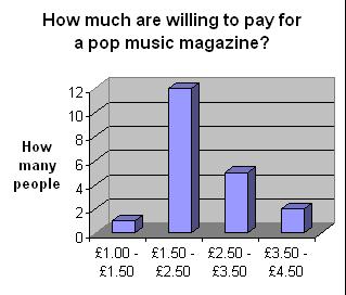
Since the majority of the target audiendce would prefer to pay anything from £1.50 - £2.50. my magazine will be this much.


Since downloads are more popular with my target audience i will do an article why downloads are over taking CDs.

Most of my target audience prefer albums to singles so there will be more about albums than singles in my magazine.


My magazine will have articles about both solo artists and groups as there is not much difference between them.


Many of the audience said yes, therefore, i will have an article about the X Factor.


The answers on this question are people from this year's X Factor, so i will have the article on this years.


The majority of my target audience prefer informal language to formal. Therefore, the language on my magazine will be informal and relevant to them.

Thursday 26 November 2009

Questionnaire results

1.Who is your favourite pop artist or band?

Take that

Beyonce X2

Lady Gaga

Michael Jackson

Britney Spears

Robbie Williams

Little Boots X4

Jonas Brothers

Taylor Swift X2

Pussycat dolls X3

Paramore

N dubz

The Script

Pixie Lott


Therefore, my double page spread article will be on Little Boots.


2.Write down three words you think of when you hear the word “pop”?

Music X2

Bubbly X2

Lively

Cheesy X5

Popular X2

Old

Colourful X2

Hippy

Fun X7

Dance X5

Rave X8

Happy X2

Concerts

Girly X2

Celebrities

Chart


3.What is your favourite colour?

Pink X6

Red X2


Yellow X3

Purple X5

Blue X4

4. Do you buy any music magazine?

Yes X10

No X10


5.If so, how often?

Weekly – 2

Fortnightly - 1

Monthly – 8

6. And which ones?


Mojo – 1

Q – 3

NME – 5

Kerrang – 3

Rocksound – 2

7. What would you like to see in a pop magazine? Please rank order them from 1 being most wanted and 5 being least wanted.


Concerts 57

Interviews 42

Reviews 59

Tour dates 74

Previews 71

8. Do you like free gifts with magazines such as, posters, cds etc?


Yes – 19

No - 1

9. How much are you willing to pay for a pop music magazine?

£1.00 - £1.50 X1


£1.50 - £2.50 X12

£2.50 - £3.50 X5

£3.50 - £4.50 X2


10.If more, how much?
N/A

11. Have you ever bought Smash Hits or Top of the Pops magazine before?
Yes X16

No X4

12. How do you purchase your music?


CDs X5

Downloads X15


13. What do you prefer?


Singles X1

Albums X19


14. What do you prefer?

Groups X7

Solo artists X13

15. Do you watch the X Factor?

Yes X14

No X6

16. If so, who has been your favourite contestant from the past 3 years?

Alexandra Burke X1

JLS X2

Eton road X1

Olly Murrs X2

Lloyd Daniels X4

Joe McElderry X3

Leona Lewis X1

Jedward X1


17. What would you prefer?

Informal X17

Formal X3

Questionnaire

Questionnaire


1.Who is your favourite pop artist or band? ­________________________


2.Write down three words you think of when you hear the word “pop”?


________________________________

________________________________

________________________________


3.What is your favourite colour? __________________

4. Do you buy any music magazine? Yes No


5. If so, how often? Weekly Fortnightly Monthly


6. And which ones? ___________________________________________


7. What would you like to see in a pop magazine? Please rank order them from 1 being most wanted and 5 being least wanted.


Concerts __ Interviews __ Reviews __ Tour dates __ Previews __

8. Do you like free gifts with magazines such as, posters, cds etc? Please circle Yes No


9. How much are you willing to pay for a pop music magazine? Please circle one


£1.00 - £1.50 £1.50 - £2.50 £2.50 - £3.50 £3.50 - £4.50 More


10.If more, how much? ___________________


11. Have you ever bought Smash Hits or Top of the Pops magazine before? Please circle


Yes No


12. How do you purchase your music? Please circle


CDs Downloads

13. What do you prefer? Please circle


Singles Albums


14. What do you prefer? Please circle


Groups Solo artists


15. Do you watch the X Factor? Please circle


Yes No


16. If so, who has been your favourite contestant from the past 3 years?


__________________________________


17. What would you prefer? Please circle


Informal Formal

Wednesday 4 November 2009

Analysis - Pop music magazine double page spread article

This is a double page spread from the magazine Top of the pops.
The language used is informal and chatty welcoming the readers and inviting them to read on with writing such as: "Hello Campers!". This presumes the genre of the magazine understands and knows this film as they are iconic disney actors and singers so therefore, only appealing to one age group.
This is also created by the dominant image of the Jonas Brothers showing that they are a big hit with this audience so they will be attracted.
Also there is a friendly image created as the characters are introduced to the readers making them feel more involved. The darker background and brighter writing and images stands out for the readers making it eye-catching.


A double page spread from another Top of the Pops magazine.
The title of the articleis spread out throughout both pages so it is clearly understandable. "DANI'S MUSIC MAKE-OVER" suggests that the readers know who "Dani" is, so she is a well known artist within this age group. Also the bold shining of music tells the readers clearly that it is to do with music.
The few colours used are pink, white and yellow to attract the audience but also because it is less exspensive. The different shapes used throughout the design such as circles and boxes seperate the text so it is easier for the readers. The main image takes up the whole of one page to focus the readers and show them who it is about.

Analysis - Pop music magazine contents page


Vibe contents page
5 images
Page numbers
one column - maybe more for a regular reader as they don't need directions
Website
colour scheme - 3 different colours


Another vibe contents

One main picture
one column
colour scheme - connects to the genre and front
Sub-titles/headlines e.g. features
Issue date


Both of these contents pages both follow the codes and conventions in some way. However, the break the codes and conventions and try to be different with one column, one image etc.

Analysis - Pop music magazine front cover


Top of the Pops - is the closest thing to a pop magazine that still exsists.
Image over masthead to show is it a recognisable and well known magazine.
Bright and different colours, different fonts with bold background to make them stand out.
Subsidiary images are used to attract a bigger audience.
Banner at the top giving more information.
True stories at the bottom.
Plain background.


Vibe - is an american music magazine.

Limited colour scheme - bold, reflects the music.
No other images - older target audience.
Plain background.
Direct address, wants the audience to notice him.
All writing in capitals, to make them bold like they can not be missed.

Pop magazine decisions 2

My magazine will be
£2.50
Monthly
Around 54 pages
Regular content
- Feedback, news and gossip, album and single reviews, gig and tour dates
Feature articles - competitions, freebies - such as posters, cds etc. interviews

Pop magazine decisions

The type of music magazine I am going to produce will be a pop magazine. I am choosing this as there are not any successful pop magazines around at the moment so there is a gap in the market. The target audience for my magazine will be unisex young teens.

Pop magazine Research

- Vibe – monthly – Top of the Pops – monthly – NME - weekly


- Top of the Pops - £2.85 – NME - £2.30 Q -£3.90

- Top of the Pops – 54 pages – NME – 66 pages

Regular content

Feedback
News
Concert Reviews
Album Reviews
Single Reviews
Gig and tour dates
Latest charts

Feature articles

Interviews (different people every month)
Freebies
Competitions

Codes and Conventions od music magazines double page spreads

  • Mainly one person - on one side
  • Quotes on image
  • Interviewer and photographer name - by lines
  • Drop capital at the beginning of the article
  • Colour scheme is limited as it it a cost issue
  • Usually more than two columns about 2-4
  • Name of interviewer in the headline is in a different colour
  • Magazine name at the bottom of the page
  • Page number, issue date and website
  • Headline is accompanied by the stand first, this introduces the article and explains what it will be about. E.g. "Abandoning their day-jobs with artic monkeys and the rascals".
  • Article has an informal mode of address.

Codes and Conventions of music magazines contents pages

  • Page number are used in the contents page to direct the audience and to find wanted pages easier.
  • Page numbers are missed out as not every page is seen on the contents.
  • Columns are used as they are easy to follow, usually there are 3/4 however, in the examples i looked at Mojo only had two, this was because they wanted to be different and brake the codes and conventions.
  • Images show snipet of the story to attract readers.
  • Subtitles and headlines are used. E.g. Regulars, feedback, news, live reviews, featues, album reviews, gigs.
  • The issue date is usually on the contents page as it is conveinient to know it is the latest issue.
  • The colour scheme is usually connected to the front cover.
  • One main image for the main story as well as several other images, these are all related to the genre of music.
  • A Web address is usually added to connect to the internet as the creators know that most people used the internet regularly.
  • The editoral is there to welcome new readers and shows the mode of address.

Codes and Conventions of music magazine front covers

  • Main image - band/singer either in long shot or mid-close up, looking at the camera to connect with the audience and engage them.
  • The body language of the solo artist or band reflects their music genre. This is called representation e.g. pop music - posed images, metal music - aggressive and hostile mode of address. The mode of address is the way in which the magazine reflects to the target audience e.g. Top of the Pops - friendly and informal, Kerrang - not engaging, lost in the music connoting that the magazine is all about music.
  • Also the main image has to be some artist or band that is well known to attract the target audience. The other images are the subsidiary images, these are for the readers who may not be that interested in the main image.
  • There is a limited colour scheme - four different colours on NME - black, red, white, grey - this is because of a cost issue as it would cost too much.
  • The masthead at the top, the typeface of this connotes the genre. E.g. NME - blocks - bold, Top of the Pops - friendly - girly - pink, Kerrang - broken - one colour (white) - straight to the point.
  • There are usually 5-10 coverlines and they all link to genre. This is so the target audience will know what to expect and they won't see something that is not supposed to be there.
  • Buzzwords are used to attract attention. E.g. plus, free, exclusive.
  • The layout and organisation are appropriate to target audience and genre. E.g. Top of the Pops is informal for kids. Or Q is formal for an older audience.

Wednesday 21 October 2009

Evaluation

To create my front cover and contents page i used the codes and conventions of magazines as guides. With my preliminary task front over and contents i tried not to be too challenging or experimental with the codes and conventions as i knew magazines worked this way. For example, on the front i kept to the guides by keeping the title in the top left hand corner in a seperate font to everything else. This was so it could be seen and recognised as the title. Also i did not cover the main image with the title as it was a brand new magazine and to do this the magazine needs to be well established. Another guided decision was to have the main coverline linking to the main image and both of these relating to the genre of magazine. For example, a picture of a student relates to the school magazine. As well as this, i stuck to a certain colour scheme of mainly the school colours. These are blue, pink, white and purple. I used these because they reflect and are easily recognisable to the school. However, that is not the only reason i used this because it would attract a bigger audience and it would cost less for fewer colours. Also i used 2 sub stories which is a little less than most magazines but i done this to keep the layout easy on the eyes. Sub stories are used for readers who are not really interested in the main image or story so then they rely on the sub stories to attract the readers attention. A banner is used at the bottom of the front cover to give a hint of what else is in the magazine. On this i use buzzwords such as "plus", this engages the readers. As well as this a tagline is used, this is situated under the title. This give the readers a snipet to what the magazine is all about. E.g. "It's all about you". After that comes the price and issue date, the price had to be a realistic amount to what the target audience can afford, e.g. 50p for school children. Overall, on the front cover i used about 2-3 different fonts, this makes different articles stand out.

My contents sticks to the guides by connecting to the front by the use of images and text. It also has an editoral to involve and welcome new readers. My contents page is like many, it has a plain background. With this it does not challenge the code and conventions as it makes it all about the information nd is straight to the point. It gives information from the front continued on to the contents as the issue and website address are on it for the reader's personal use. As well as this i stuck to the codes and conventions by numbering the pages with information to make it easier for the audience but also i numbered pictures too.

In the construction of my media product i used a range of different media techologies. These included Adobe Photoshop for creating the front cover, Quark for creating the contents page and Digital Cameras for th photography in the magazine. This was all effective as it made my font cover and contents page look like a real magazine.

To find out what my magazine was like from another prosective i got some audience feedback which consisted of praise and constructive critism. For example, for my front cover i recieved comments such as it was well structured, neat in design and effective in colour. Also that my contents had a good layout and content and that it was easy to see everything you need to know as it was to the point. However, some people suggested it needed a bit more colour to connect to the front cover.

Contents page editing and final


Sunday 11 October 2009

Final front cover

Looking back on my original plan you can see that i have kept the main details the same just altered little bits to add to the effect of a magazine.
I have kept the title of "Success" the same and the catch line "We do it all for you" as this gives the magazine and school a good image.
I used the same colour scheme of the school logo for the cover as it gives it a professional look and is easily recognisable.
I kept the front cover looking simple, as it is easy on the eye and people are more likely to look inside as it does not confuse them. I done this by not putting many coverlines on it and by putting a banner at the bottom to make it more realistic but also easier to read.

Edited Pictures and Front Cover