To create my front cover and contents page i used the codes and conventions of magazines as guides. With my preliminary task front over and contents i tried not to be too challenging or experimental with the codes and conventions as i knew magazines worked this way. For example, on the front i kept to the guides by keeping the title in the top left hand corner in a seperate font to everything else. This was so it could be seen and recognised as the title. Also i did not cover the main image with the title as it was a brand new magazine and to do this the magazine needs to be well established. Another guided decision was to have the main coverline linking to the main image and both of these relating to the genre of magazine. For example, a picture of a student relates to the school magazine. As well as this, i stuck to a certain colour scheme of mainly the school colours. These are blue, pink, white and purple. I used these because they reflect and are easily recognisable to the school. However, that is not the only reason i used this because it would attract a bigger audience and it would cost less for fewer colours. Also i used 2 sub stories which is a little less than most magazines but i done this to keep the layout easy on the eyes. Sub stories are used for readers who are not really interested in the main image or story so then they rely on the sub stories to attract the readers attention. A banner is used at the bottom of the front cover to give a hint of what else is in the magazine. On this i use buzzwords such as "plus", this engages the readers. As well as this a tagline is used, this is situated under the title. This give the readers a snipet to what the magazine is all about. E.g. "It's all about you". After that comes the price and issue date, the price had to be a realistic amount to what the target audience can afford, e.g. 50p for school children. Overall, on the front cover i used about 2-3 different fonts, this makes different articles stand out.
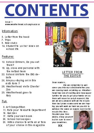
My contents sticks to the guides by connecting to the front by the use of images and text. It also has an editoral to involve and welcome new readers. My contents page is like many, it has a plain background. With this it does not challenge the code and conventions as it makes it all about the information nd is straight to the point. It gives information from the front continued on to the contents as the issue and website address are on it for the reader's personal use. As well as this i stuck to the codes and conventions by numbering the pages with information to make it easier for the audience but also i numbered pictures too.
In the construction of my media product i used a range of different media techologies. These included Adobe Photoshop for creating the front cover, Quark for creating the contents page and Digital Cameras for th photography in the magazine. This was all effective as it made my font cover and contents page look like a real magazine.
To find out what my magazine was like from another prosective i got some audience feedback which consisted of praise and constructive critism. For example, for my front cover i recieved comments such as it was well structured, neat in design and effective in colour. Also that my contents had a good layout and content and that it was easy to see everything you need to know as it was to the point. However, some people suggested it needed a bit more colour to connect to the front cover.
Wednesday, 21 October 2009


Sunday, 11 October 2009
Final front cover
 Looking back on my original plan you can see that i have kept the main details the same just altered little bits to add to the effect of a magazine.
I have kept the title of "Success" the same and the catch line "We do it all for you" as this gives the magazine and school a good image.
I used the same colour scheme of the school logo for the cover as it gives it a professional look and is easily recognisable.
I kept the front cover looking simple, as it is easy on the eye and people are more likely to look inside as it does not confuse them. I done this by not putting many coverlines on it and by putting a banner at the bottom to make it more realistic but also easier to read.


Subscribe to:
Posts (Atom)